
I love a good Excel spreadsheet. So when I say this post on LinkedIn (LINK) I started to look at the data they had posted on their page here:
https://www.livefrombrexit.com/petitions/241584
Before we start, this is not a political blog, nor am I casting into doubt any party etc,
this is purely an exercise in numbers and graphs.
The Background
Brexit, ah sweet sweet political chaos of UK politics. In the midst of it all, a Petition was set up on the official UK Government site and lo and behold it went nuts. as of today, over 5 million people have signed the online petition to have Remain re-discussed in Parliament. This is the poll in question:
To complete the Poll, this is the data you must provide:

Name, eMail, Location, Postcode and 2 tick-box confirmations. all fairly straightforward so far?
The Data
This data is a list of 650 regions (I guess using the postcodes form input to determine voter location) in the UK and a correlation as to how each vote is distributed per region.
| Constituency | MP | Signatures ▼ | % of Voters | |
|---|---|---|---|---|
| 1 | Bristol West VOTED REMAIN 79.3% | Thangam Debbonaire MP LABOUR MAJORITY: 37,336 | 32,364 | 35%of 93,003 |
So for example, in Bristol West, 79.3% originally voted to Remain in Europe and, under this petition, 32,364 of 93,003 people have voted to remain in Europe.
Fascinating data, and well done to whoever has written the API, code and website to collate this.
As at 19:54 on 24/03/2019 there were :
5,202,102 signatures with an average
563 per minute voting.
This has caused a stream of issues for the tech team who are trying to maintain the Petition website : LINK
A lot of people have been asking about numbers. Between 80,000 and 100,000 people have been simultaneously viewing the petition to revoke article 50. Nearly 2,000 signatures are being completed every minute.
I know that there have been questions about bots being used and with the rate being fairly consistent, even throughout the night, I have been interested myself in how people are voting, where, is this social spread on local websites, how are 500 new sign-ups happening every minute?
So I thought I’d have a look at the data myself, just to see what the data looked like and the distribution etc.
The Method
Here is the rough methodology used (if you’re playing along at home!)
- Copy and paste the data from the website into Excel
- Re-size columns so I can see the titles
- Also re-format titles so they are the same
- Delete the voting area names (not that bothered about that data right now)
- And moved the rank to the end
- Use Text to Columns on Percentage and Total column to split them into their own columns
- Replace %of to #
- Split on #
- Re-calculate the Percentages
- Because I’m a geek and like to do my own maths!
- Sort by
- Percentage but don’t include the ranking column
- Create graphs
- Copy sheet
- Sort by
- Signatures but don’t include the ranking column
- Create graphs
The Percentages
Here is the first graph. This is the 650 data points sorted by Percentage.
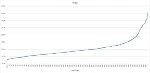
At first I thought I had got something wrong, so I re-ran everything and got the same curve. I thought I had got something wrong as the curve looks just a little bit too equally spread with variant data points between 600 and 630. I know that I studied that type of curve at Uni, but can’t remember the name – Google says logistic regression curve, but not too sure. Normal distribution curve? Not sure – if you are a mathematician and you know … drop me a message below !!
The Signatures
So I thought I would then look at the data but from the raw number of votes. I know I should get a similar curve after all the signatures relate to the percentage but the numbers per area could change that curve e.g
2000 votes in an are could give 20% giving a ranking of 100th (for example)
but
if the population in that area is 10,000 and there are 2000 votes then the ranking will be different (I think, someone check my maths here please !!!)
So here is the Signatures graph:
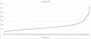
So the curve is different, especially around that 640 – 650 mark. However, it is the same distribution – that familiar curve. My question is … is that normal? Do populations vote like this?
Conclusion
I don’t have a conclusion myself as I just can’t see the maths for the curves. I can see that that curve is definitely a distribution of some kind. When I showed the curve (with no context) to my 15 year old daughter she thought it was a computer generated graph, which is my thought too – I’d expect the curve to be more lumpy and uneven in distribution.
So over to you …
Are you a mathematician who can look at that graph and tell me:
- What is the function that creates a graph like that?
- Is that a usual distribution for a population voting?
- If this is not a curve that would be created by population voting, how is it caused?
Any ideas from yourselves – I’d love to know … especially if voting, data, maths etc is your field 1
BUT … keep the politics out please, I’m not up for that discussion.
[si-contact-form form=’4′]

Leave a Reply